An Essay on Typography
by Eric Gill
excerpted New York Times review by Paul Rand
Feast of St James the Apostle & Brother of St John the Theologian
Anno Domini 2020, April 30, 2020
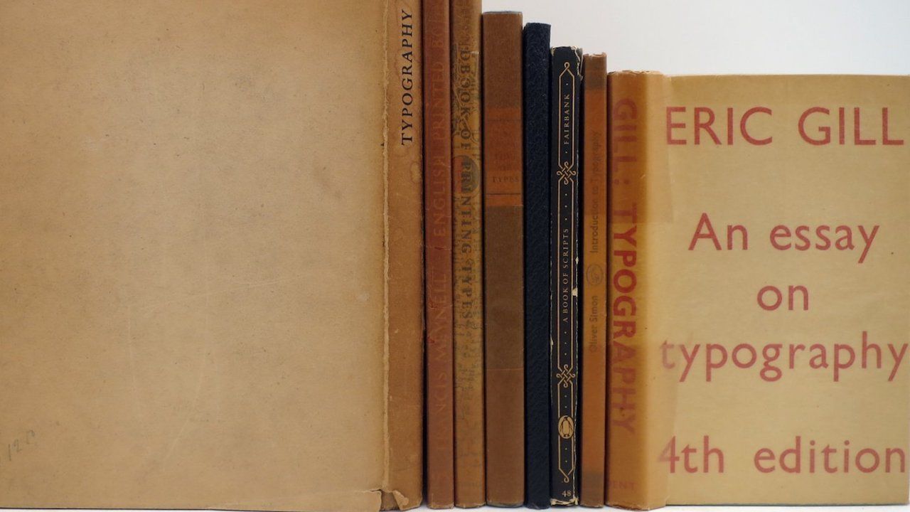
THIS ADMIRABLE
little book, first published in 1931 in a limited edition, is important less for its erudition about the theory and practice of typography than for the moral support it gives to artists, whose principal concern is the quality of their work; to businessmen, who are chiefly interested in the bottom line; and to printers and publishers, who are more concerned with traditional practices than with wild ideas.
Even though An Essay on Typography
deals with technical difficulties, the history and evolution of letters, the craft of typography, type design and manufacturing, page makeup, color and ink preparation, paper making, book binding, publishing and even orthography, it is written with clarity, humility and a touch of humor. Eric Gill’s writing style moves between a chuckle and a grimace, avoiding a lot of technical jargon and pretentious allusions. And Gill, who was not only a British typographer, but a sculptor, engraver and writer, panders to no one. One wonders how so much could have been packed into such a tiny package - probably enough to have made experts in typography and printing like the Americans Daniel Berkeley Updike and Theodore L. De Vinne marvel.
Gill’s ultimate goal, like that of any serious artist, had less to do with means than with ends - the proper balance between form and content, between man and machine. He cautions the worker not to get too involved with the machine. “It is important that the workman should not have to watch his instrument, that his whole attention should be given to work.” “The mind,” he further asserts, “is the arbiter of letter forms, not the tool or the material.” For those dazzled by the computer, who see the machine as a magic muse, these words are particularly useful.
On more than one occasion he implies that the businessman’s involvement in esthetics is incidental, not intentional. “And the printer whose concern is quality,” he says, “is not a man of business.” Similar expressions – “by men of brains rather than by men of business” and “the history of printing has been the history of commercial exploitation” - sum up Gill’s attitude about industry, even though he owed much of his livelihood to English type founders.
He even advises the publisher where his name should appear in a book, and calls the ordinary title page “a showing off ground . . . an advertisement for the printer and publisher.” The names of printer and publisher, he says, should appear at the end of the book where they logically belong. The design of the title page of the 1931 edition, for example, is a masterpiece of understatement, containing the title, the author’s name and the table of contents in a design so splendid that, even today, it would be considered revolutionary.
[…]
To Gill’s eye, lettering was “as beautiful a thing to see as any sculpture or painted picture.” Yet the relationship between words and spelling, between printed words and speech, he considered irrational, and he suggested that some sort of shorthand system, which he called phonography, be provided as a possible solution. “We need a system in which there is real correspondence between speech . . . the sounds of language and the means of communication.” This had nothing to do with speed. “Think slowly, speak slowly, write slowly” is what he exhorted his readers. […]
*Full review originally appeared as "The Case for the Ampersand" in The New York Times, September 10, 1989, Section 7, Page 22. Available in full online at this New York Times link.
Share this Post on Your Preferred Platform
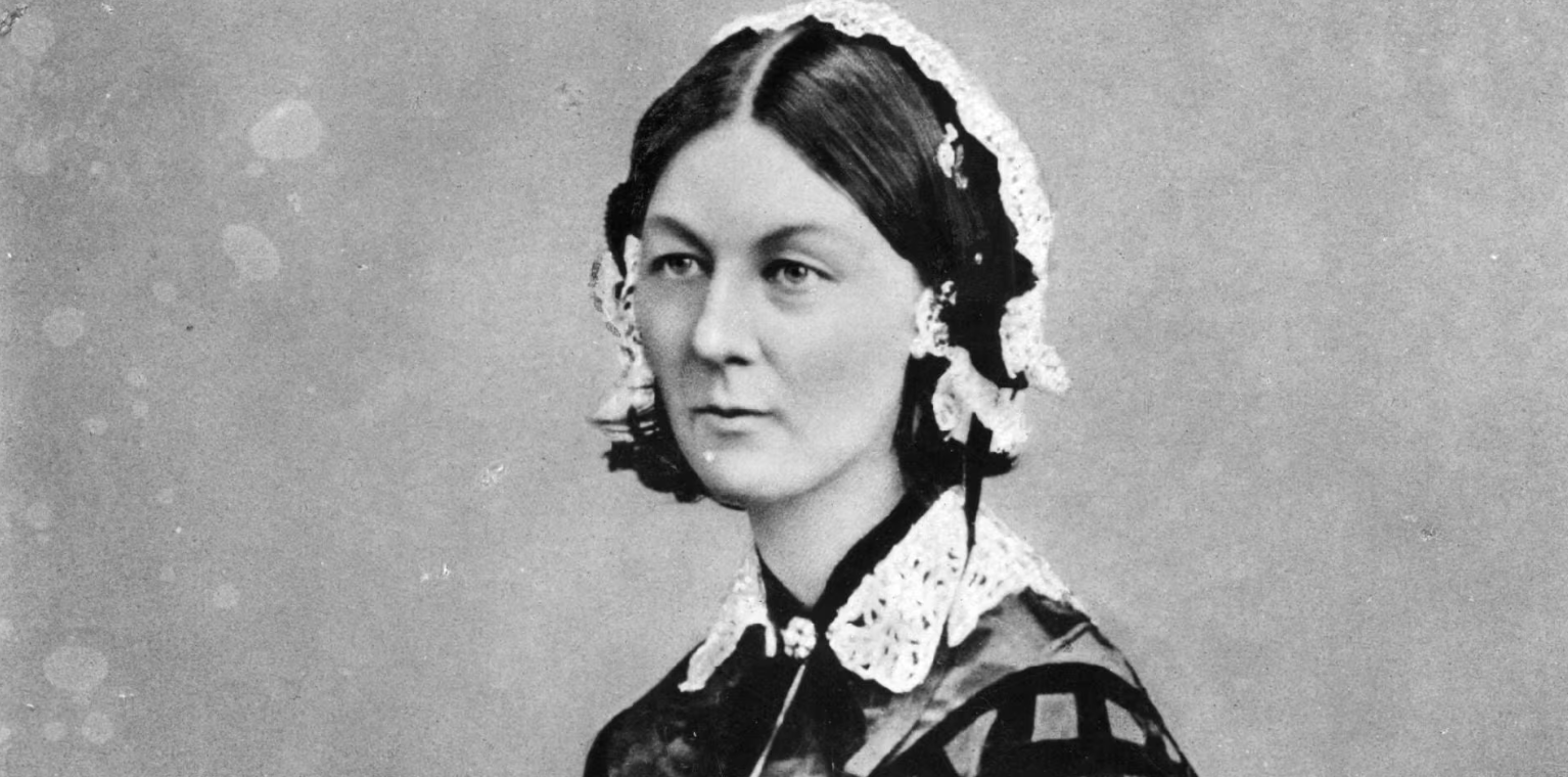
The Sisters of Sophia will gather on the Commemoration of the Great Martyr Theodore, Anno Domini 2026, February 17. Rachel Garton will present The Battlefield of Compassion: Florence Nightingale, Clara Barton, and St Verena . Sisters of Sophia When Every third Tuesday Where The Ladder 2836 E Douglas, Wichita Parking available behind Eighth Day Books Schedule Food, drink, and fellowship at 6:30pm Eighth Day Convocation & Lecture at 7:20pm Membership Required? No, but do consider joining the community! Learn more and join here !

The Hall of Men will gather Thursday evening on the commemoration of St Meletius, Archbishop of Antioch, Anno Domini 2026, February 12. David Beutel will present on St. John Henry Newman. St. John Henry Newman (21 February 1801 – 11 August 1890) was an English Catholic theologian, academic, philosopher, historian, writer, and poet. He was previously an Anglican priest, and after his conversion to Catholicism, became a cardinal. Newman's beatification was proclaimed by Pope Benedict XVI on 19 September 2010 during his visit to the United Kingdom. His canonization was officially approved by Pope Francis on 12 February 2019, and took place on 13 October 2019. Come and jo in us for the first toast of 2026 at the Hall of Men! If you haven’t seen a Catholic listen to the life story of John Wesley; if you haven’t watched a Protestant learn about Evagrius of Pontus; and if you haven’t seen Orthodox, Catholic, and Protestant men sit around a table together and talk theology until midnight . . . then you need to come to the Hall of Men. When The commemoration of St Meletius, Archbishop of Antioch, Anno Domini 2026, February 12. Where The Ladder at 2836 E. Douglas, Wichita, KS 67214 Schedule Doors Open at 7 pm Food is served at 7:30pm Eighth Day Convocation at 8:30pm Presentation and toast by Derek Hale immediately following Convocation. Membership Required? No, but do consider joining the community! Learn more and join today here .

